

Aeromexico Rebrand
Identity System, Brand Strategy, UX/UI Design, Environmental Graphics
2016
Aeromexico is the flag carrier airline in Mexico and also one of the founding members of SkyTeam. The concept for this project is to create a refreshing identity for Aeromexico to attract more international travelers and stand out in the highly competitive airline industry. The visual identity guidelines were developed to keep the graphic language consistent and create a shared visual voice that reflects the excellence of Aeromexico.
The key attributes of the rebrand are: global, reliable, modern, caring, efficient, and welcoming.
New Logo
Current Logo
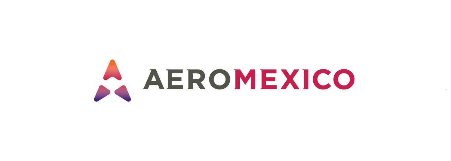
Final Logo
Inspiration
The logo "AM Arrow" was inspired by the north arrow of compass, a symbol of direction and navigation, and the symmetrical shapes of “A” and “M”. Aeromexico is always welcoming and caring about people, so the arrow appears slightly rounded, bringing humanity to this identity.
Concept
"AM Arrow" is the new logo of Aeromexico and it has several meanings behind it. It is a north arrow formed with the shape of “A” and “M”, which stands for the name of the brand. The north arrow is the symbol of direction and navigation, and the three triangle-like shapes symbolize progressing to different directions, which speak for the identity of Aeromexico as a transportation brand. As a symmetrical mark, it looks stable, showing that it is a safe and reliable company that people can depend completely on.

Logo Clear Zone
In order to maintain the integrity of the logos, logo clear zones have been established for each use. The clear zones indicate the area in which no other text or graphic is to appear.
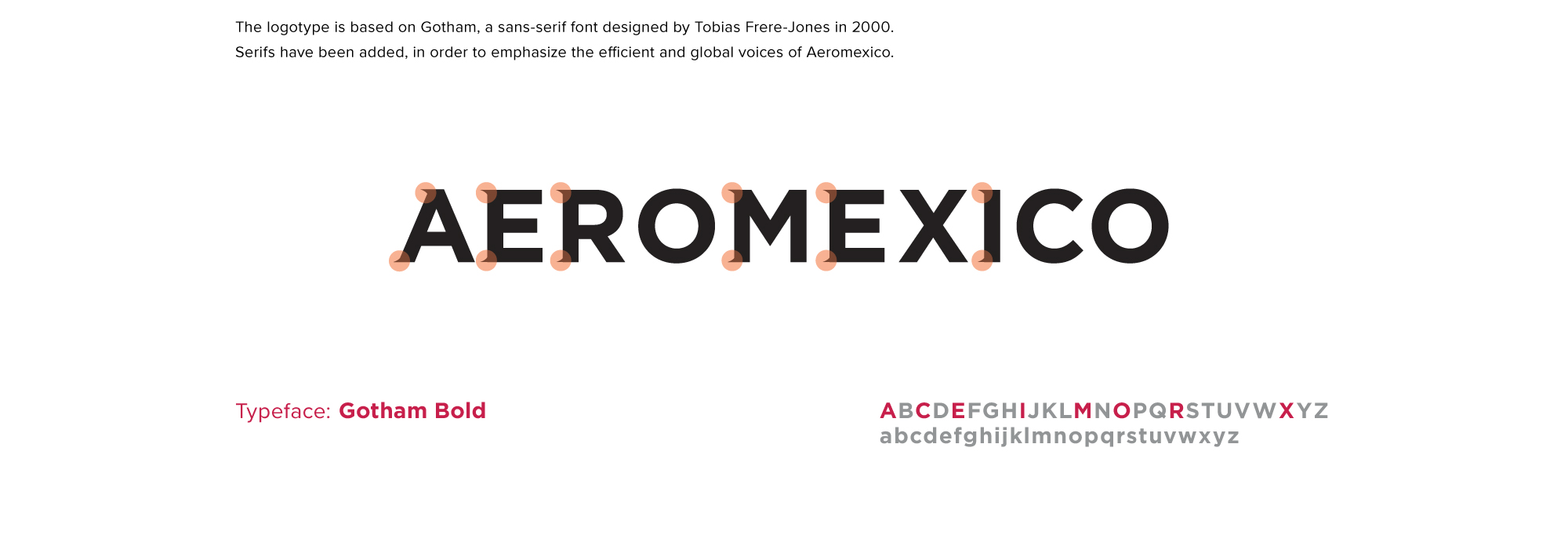
Logotype
The logotype is based on Gotham, a sans serif font designed by Tobias Frere-Jones in 2000. Serifs have been added to the logotype, in order to emphasize the efficient and global voice of Aeromexico.
Logos of Subsidiaries

Typography

Colors

Print Collateral
Business cards for Aeromexico and its subsidiaries are designed based on the logo colors of each company. Boarding passes for economy class, business class and first class, and membership cards are also developed for the passengers.


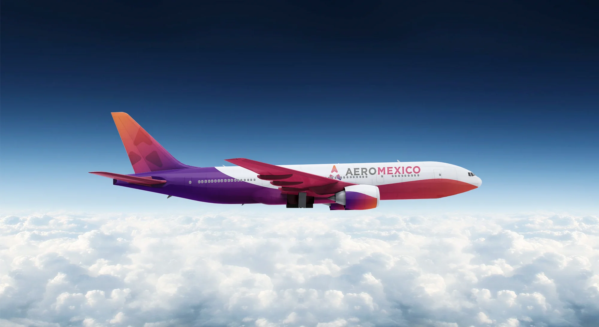
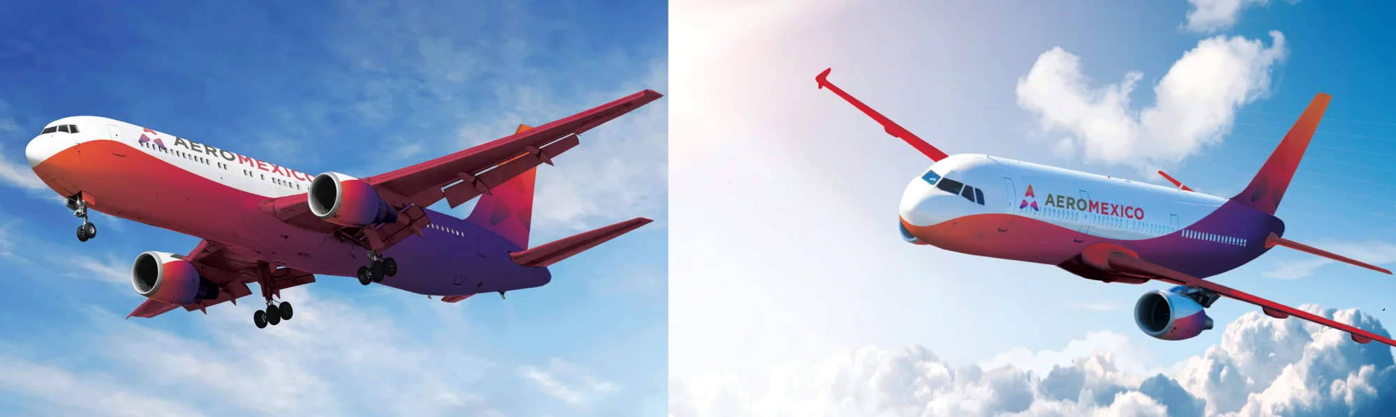
Livery
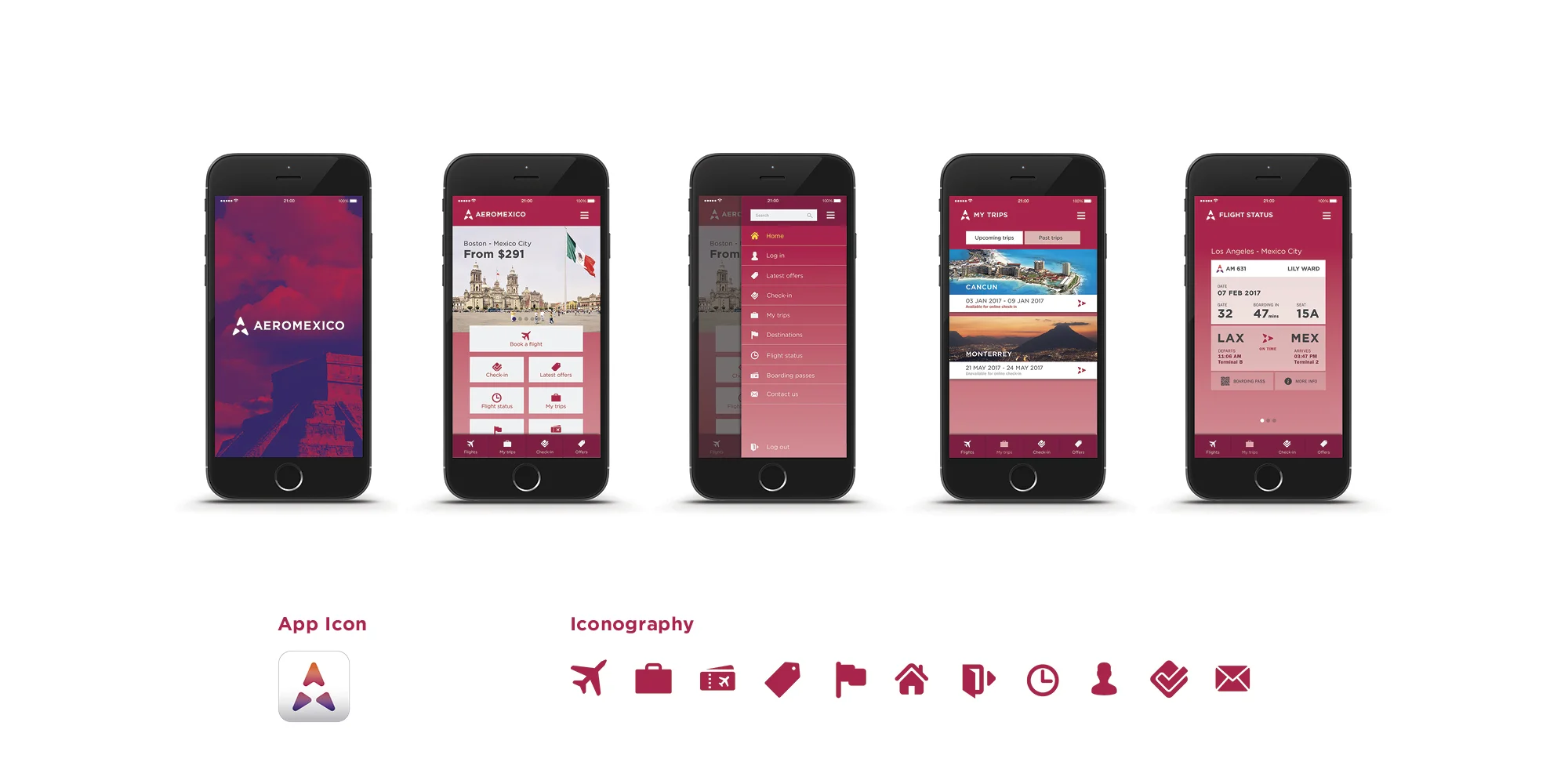
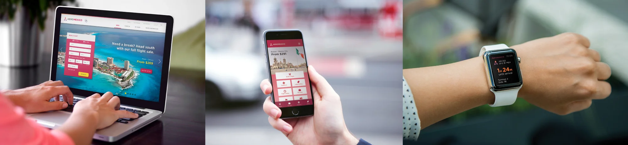
Website & Mobile App


Airport


Cabin


Uniform

Advertising Campaign


