Juniper Networks Internship
Role: UX/Visual Design Intern
Juniper Networks HQ in Sunnyvale, CA
May-August 2018
In the summer of 2018, I had a UX/Visual Design Internship at Juniper Networks HQ in Silicon Valley. Working in an internal applications team, my internship project was to lead the visual design of Stencil, a design system that ensures consistency across enterprise-level applications and improves developer efficiency. I was the only visual designer for Stencil and I collaborated with a UX Engineer who was responsible for implementation in React.
Besides Stencil, I also worked on 3 side projects, including the UX design of a web application (supply chain management tool), a design concept for employee social profiles in the current search directory, and a visual design concept for the password reset tool.
I felt fortunate to get selected as the only Design Intern in summer 2018, and to be a design evangelist (when I wasn’t designing) among colleagues in an engineering-oriented company.
Introducing Stencil
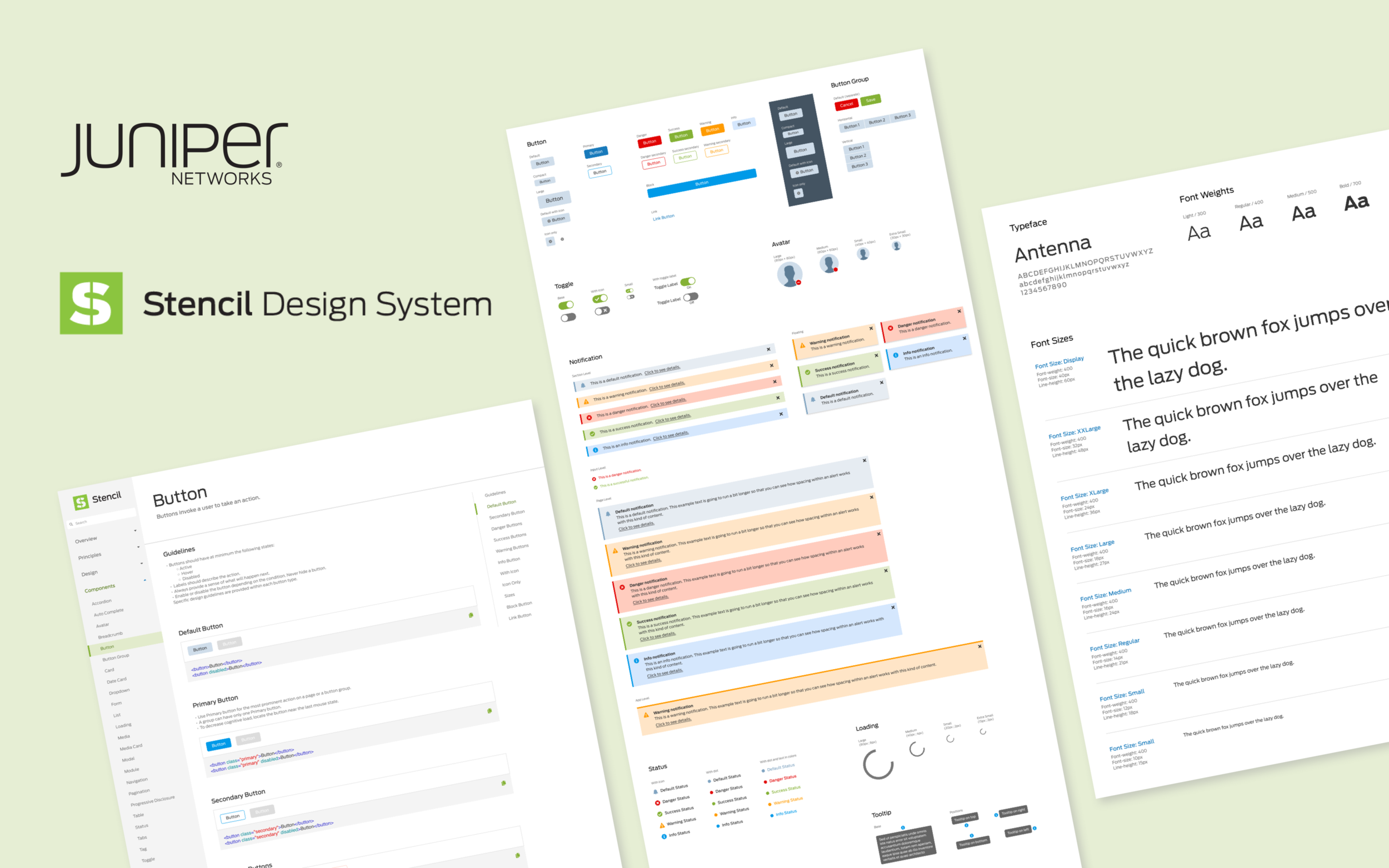
Stencil is a scalable design system and front-end library. It is a collection of reusable components, guided by clear principles that can be used in developing all of IT’s internal web applications at Juniper Networks. Stencil comes in a library in Sketch and would be implemented with React.

Benefits of Stencil
Improve developer efficiency by pre-defining commonly used components
Save time for designers and front-end developers in the future. Instead of coding everything, they can directly use the components.
Ensure interaction and visual consistency
Applications will have consistent branding, look and feel, and experience.
Scalable and Shareable
Easy to add and maintain the components within the system. Adoption is as easy as plug and play.
Deliverables of Stencil
Design Principles
Color Palette
Typography
Components
Template
Documentation Website
Identity (Logo)
Design Principles
I’ve developed 5 design principles helping designers create consistent experiences of the products, and guiding them to make good design decisions:
Be Simple: Easy for users to understand and use the products without any confusion.
Be Efficient: Helping users to work faster and confidently with better workflows.
Be Elegant: Interfaces are sophisticated and visually appealing to the users.
Be Adaptable: Can apply to different devices and platforms, now and the future.
Be Proactive: Anticipate and cater to user needs and provide relevant feedback wherever necessary.

A Principles Diagram was created based on Maslow's hierarchy of needs.
Stencil Identity
Key Words: Bold, Simple, Organic
Concept: The shape of the logo looks like a stencil of “S”, indicating the name Stencil. The heavy stroke speaks for the bold voice of Juniper, and green is fresh and organic, aligning with the organic brand voice of Juniper.

Logo Clear Zone has been established in order to maintain the integrity of the logos, which indicates the area in which no other text or graphic is to appear.

Stencil badges that will be used for applications built with Stencil.

Color Palette
The color palette was developed based on the brand colors of Juniper Networks (based on the corporate brand identity guidelines), along with support colors to have sufficient hues, tints and shades to use.

Typography
Typography is an essential part of the design system that brings consistency across platforms and devices. Good typography can create clear hierarchies and organize information that helps guide users through an experience. The typeface, Antenna, is the brand typeface of Juniper Network, and needs to be used for all typographic applications according to the brand identity guidelines.

Components
After analyzing the commonly used components used by the team, I’ve put together a list of components for myselft to start designing:
Accordion
Avatar
Auto Complete
Breadcrumb
Button
Button Group
Card
Date card
Form
List
Loading
Media
Media Card
Modal
Module
Navigation
Notification
Pagination
Progressive Disclosure
Status
Table
Tabs
Tag
Toggle
Tooltip


My Sketch workspace:

Documentation Website
By the end of the project, I designed a documentation website that provides standards of when and how to use components and access to the resources. I also wrote guidelines for the components on the website. Here’s an example for the Button components:

Logo Design Process
Sneak peek of my design explorations of the Stencil identity.


Internship Memories
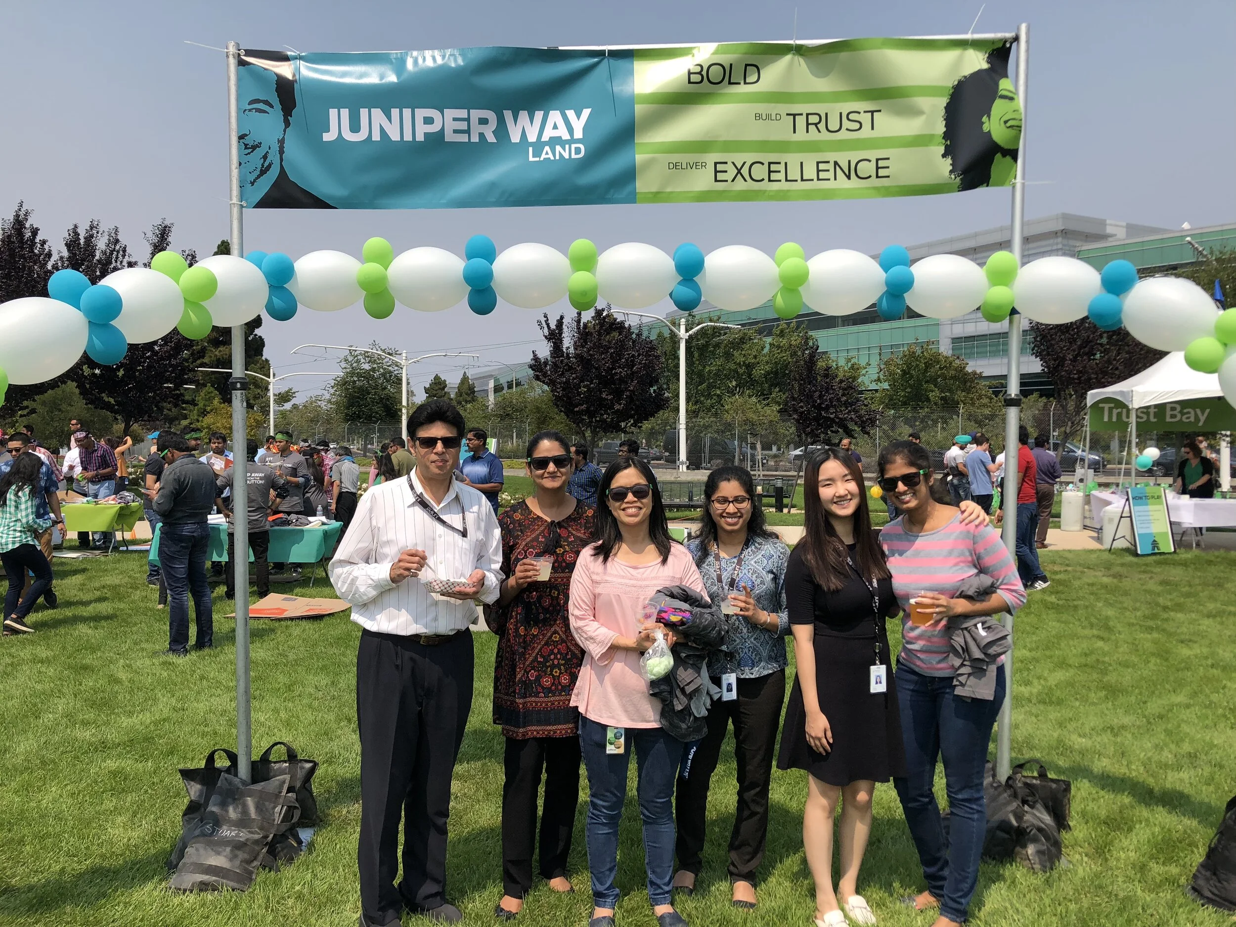
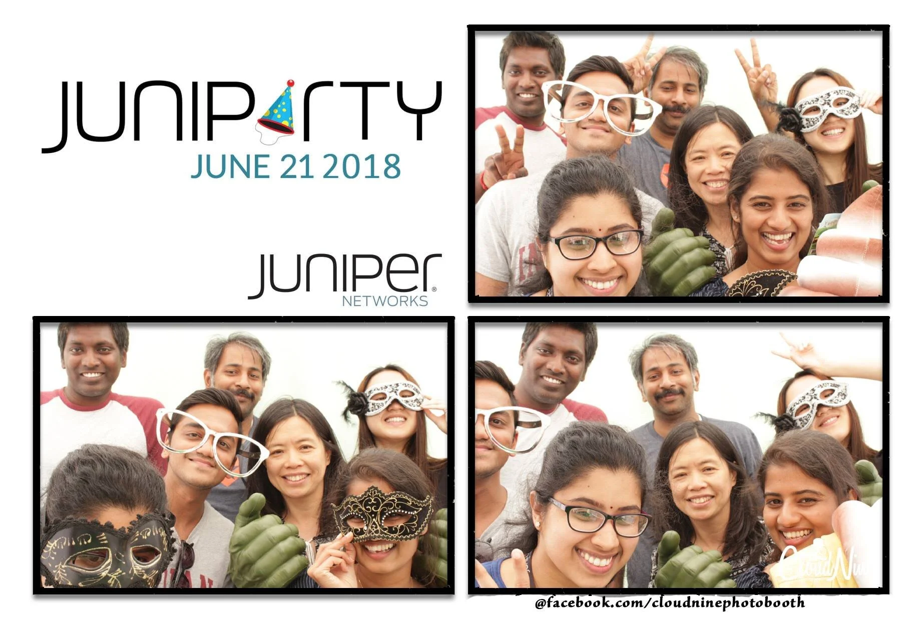
Besides my design projects, I had a lot of great memories of attending all different kinds of events such as the Summer Company Meeting with CEO Rami Rahim, Juniparty, Junivator Day (Junivator stands for the employees at Juniper Networks). Some intern program activities included an escape room and bowling on an intern off-site day. On the last day, all interns went to the Intel Computer Museum for a visit and had dinner at the museum as well!
All of these allow me to have a better understanding of the company culture by interacting with colleagues from many departments and teams. I also made some great friends whom I am still in contact with today!