
COVID Point
UX/UI, Product Design
Role: Research, UX Design, Visual Design, Prototyping, User Testing
Teammates: Aneesha Kommineni, Cynthia Zhou
Tools: Figma, Lucidchart, Miro
Time: October–December 2020 (8 weeks)
As we go into the second year of the pandemic, staying inside has become an increasingly difficult option for many. With more and more people outside, the number of COVID cases is on the rise and will only continue to grow.
COVID Point is a mobile app that helps U.S. residents stay informed about the COVID-19 risk in their geographic area and alerts them of their potential exposure to COVID-19 while respecting their privacy.
The project was done in the User-Centered Design course at the University of Washington, under the guidance of Dr. Tyler Fox.
Design Highlights
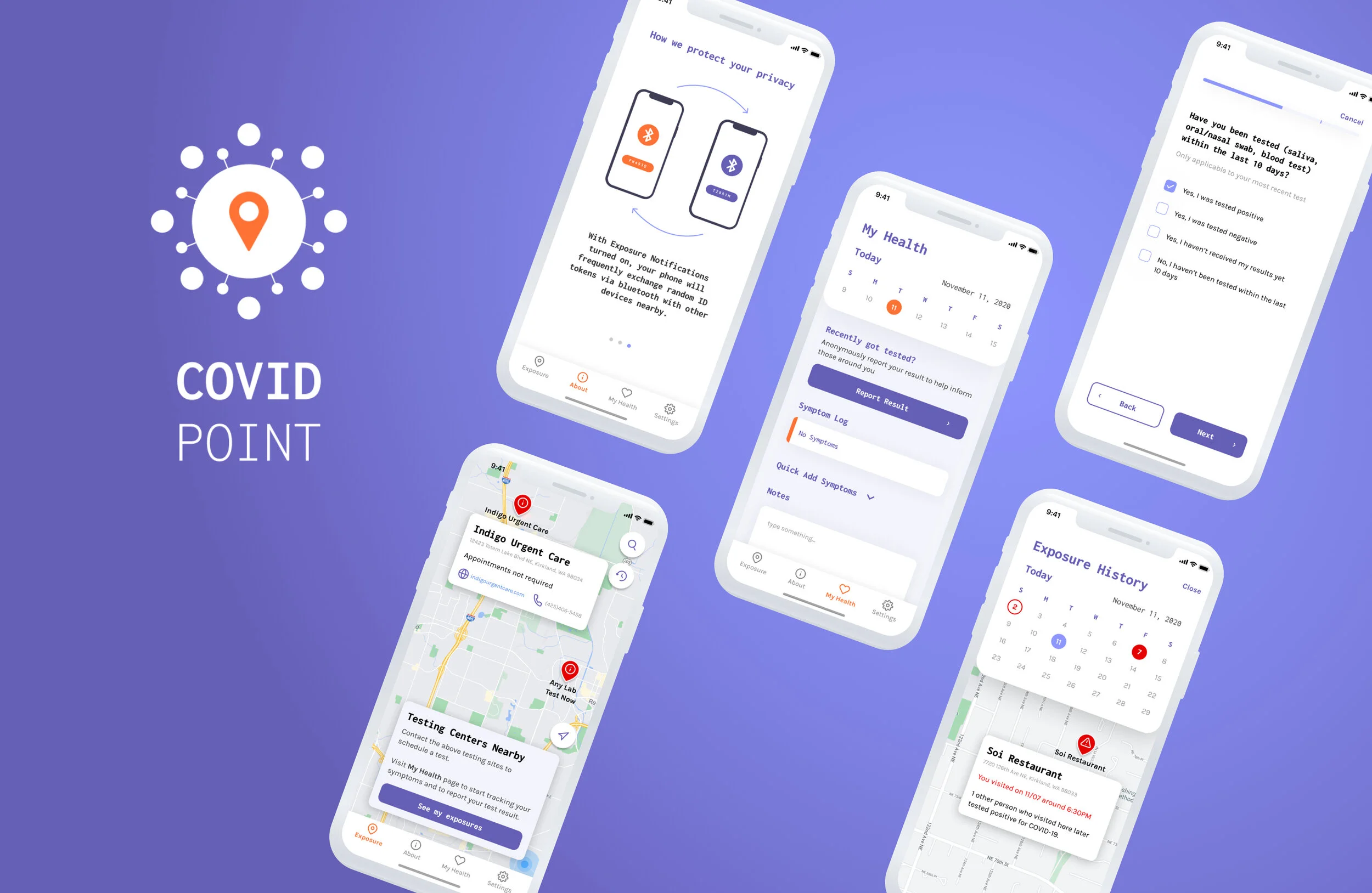
Find out Exposures
Get notified about when and where you come into contact with a positive COVID-19 case
Find Nearby Testing Centers
View nearby testing centers' location and information
Check a Zip Code or a Location's Safety Level
Search to see a location's busy-ness and safety level prior to going out
Quick Add Symptoms
Easy access for logging any COVID-19 symptoms
Self Report a Test Result
Quick survey collecting anonymous positive COVID-19 testing results to inform others nearby of potential exposure
How the App Works
Carrousel to help answer some questions users may have about the core app functionality
Initial Design Question
How can we help people stay informed about their exposure to COVID-19 (and other concerning public health incidents)?

As we go into the second year of the pandemic, staying inside has become an increasingly difficult option for many. With more and more people outside, the number of COVID cases is on the rise and will only continue to grow.
Research
To further explore our design problem space, we identified various stakeholders involved and employed three research methods to better understand our potential users.
Stakeholders
Primary
People in the United States who go outside and want to be informed about relevant COVID-19 risks in the local area(s) they visit.
Necessity
Essential workers
Grocery store shoppers
Hospital, dental, pharmacist visitors and patients
Restaurant goers - people who pick up food for delivery or to-go
Caregivers
Travellers - people who need to travel for family emergencies, job relocations, etc.
People who take public transportation to get to places
People who visit professional services (e.g., salon, barber, mailing, banks, etc) places to be serviced or access a service
Tertiary
Organizations that collect and publicize COVID-19 data, such as:
WHO, CDC, government agencies, and public health records
Hospitals and testing centers
Healthcare organizations
Personal Health
People who exercise at the gym
People who visit public outdoor areas
People who visit recreational facilities
Travellers - people who travel for fun
Restaurant goers - people who dine in to eat at restaurants to have social interactions with friends and family as a break from quarantine isolation

Research Methods
“I'm uncomfortable in grocery stores when some shoppers do not respect the 6-feet social distancing policy.”

Our focus group and interviews revealed further details about what would be most helpful to users as well as concerns related location sharing and privacy around personal health data.
Before going outside, participants indicated they want to know how busy or crowded a place is beforehand, visualize the density of a location, and monitor the current status of lines for popular places such as the grocery store.
Almost all of our participants cautioned against the use of their precise location as it can infringe on their privacy.
Almost all of our participants stated they would be more comfortable providing medical data if it’s anonymized and not invasive.
Many of our participants also cautioned against having too many notifications as they can get annoying and cause the user to ignore them.
“I feel alarmed when I'm outside. Just not happy and not fully enjoying the outside world.”
Key Findings
Most people go outside at least twice a week and for at least one hour
Most people are also somewhat familiar with COVID-19 and its regulations
Most people are somewhat interested in receiving COVID-19 related news and notifications
Most people are either comfortable or indifferent with their location being used for health-related reasons
Personas


Refined Design Question
How can we inform people about the COVID-19 risk in their geographic area and alert them of their potential exposure to COVID-19 while respecting their privacy and not overwhelming them with information?
Design Requirements
Based on our exploratory research, we identified the following design requirements:
Should alert users in the United States if they’ve recently been in areas with other people who have tested positive in a way that doesn’t overwhelm or cause people to become desensitized to the alerts.
Should provide the latest information about COVID-19 rates close to them.
Should provide information about the density of people in a certain area.
Should allow users to anonymously self report infection and/or symptoms for their own tracking purposes as well as to help the greater community be informed about their risk.
Should allow users to supply location information while clearly signalling to them that their information will not be compromised, will be kept private and confidential, and only used to help others in their community understand their overall risk.
Should give users choice of when their location is shared and the level of granularity at which location is pinpointed (e.g., zip code rather than exact address).
Should provide users with information on nearest testing centers.
Ideation
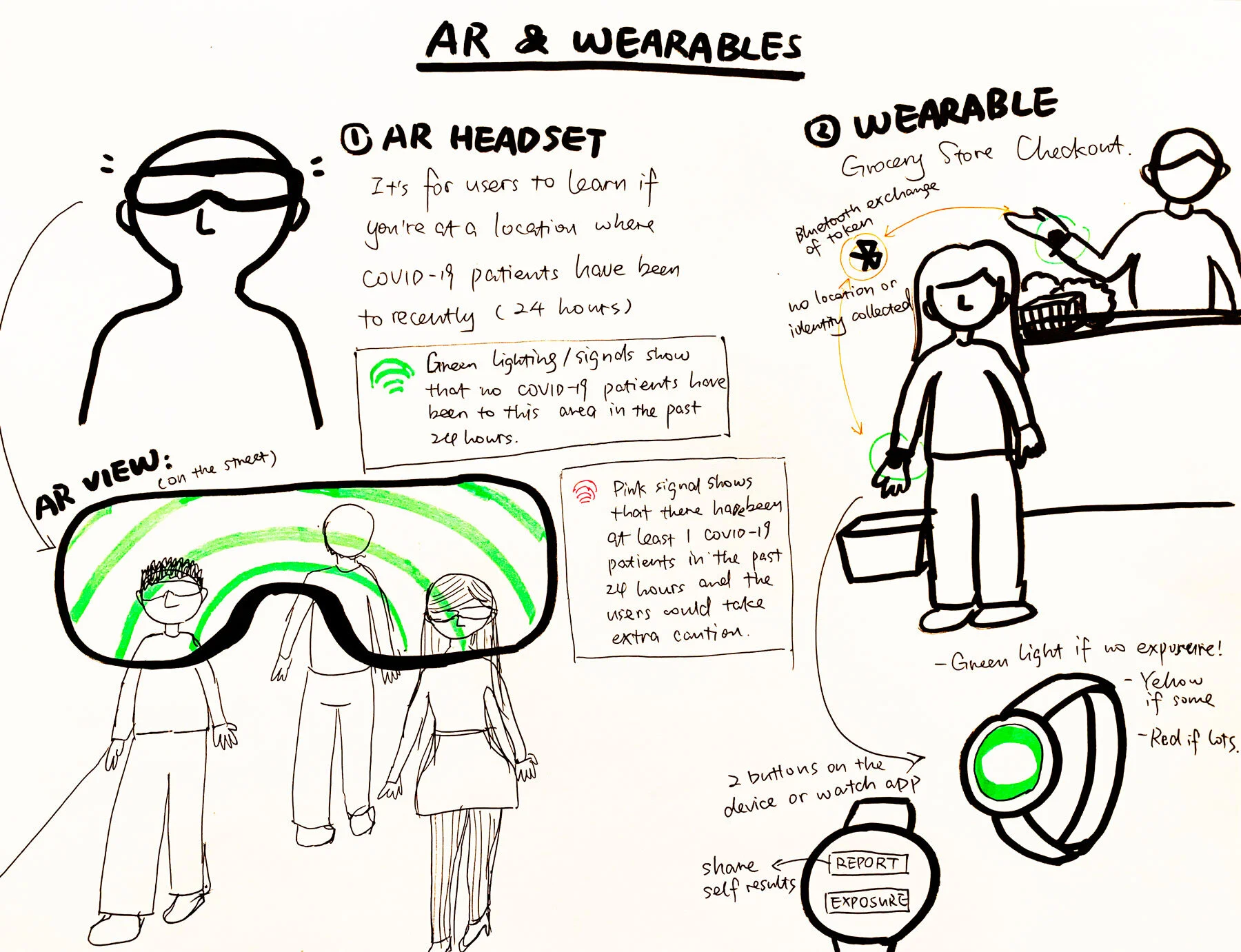
While we did explore physical displays at locations such as grocery stores and augmented reality with wearable tech as other possible solutions, we decided to go with a mobile app because it is the easiest way to immediately notify users and alert them to relevant updates. No additional equipment is required of the user either, besides the smartphone, most people in our stakeholders’ groups have nowadays.
Our research findings showed people want to know most about COVID rates near them, in places they frequent which is why one of the screens is a map view so folks can look up their risk before deciding to go to a place. We also help users track their own symptoms so they can see an increase in temperatures and changes in respiratory conditions through the analysis we do on the data they input. And they can self-report a positive test result which will help our aggregate exposure risk assessments.


After we finalized our design concept, we storyboarded to further understand user scenarios.

Information Architecture
Our information architecture (IA) of the design solution displays the hierarchy and underlying structure within our design solution.

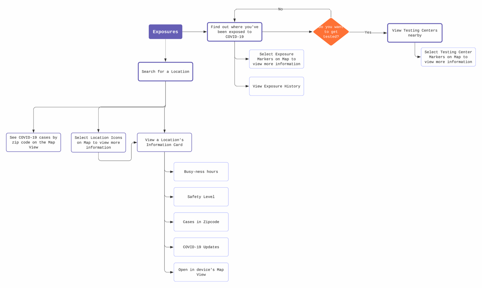
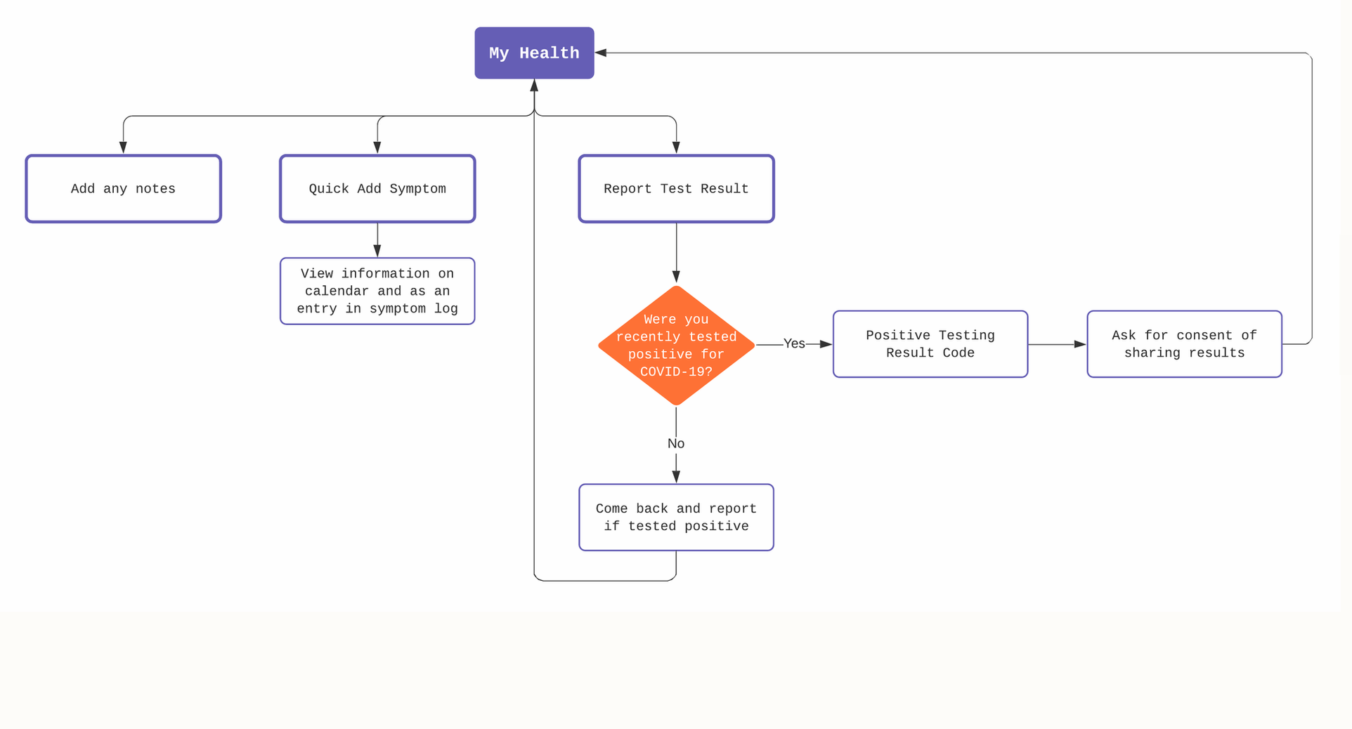
User Flow Diagrams
From our ideation phase, we created user flow diagrams to map core actions users will take and visualize features we want to implement.
Prototyping
1st Round of Wireframes
Usability Testing
We conducted usability testing with 5 participants with our first version of the medium-fidelity prototype on Figma which we decided to test. First, we created the following tasks to give to our users to test:
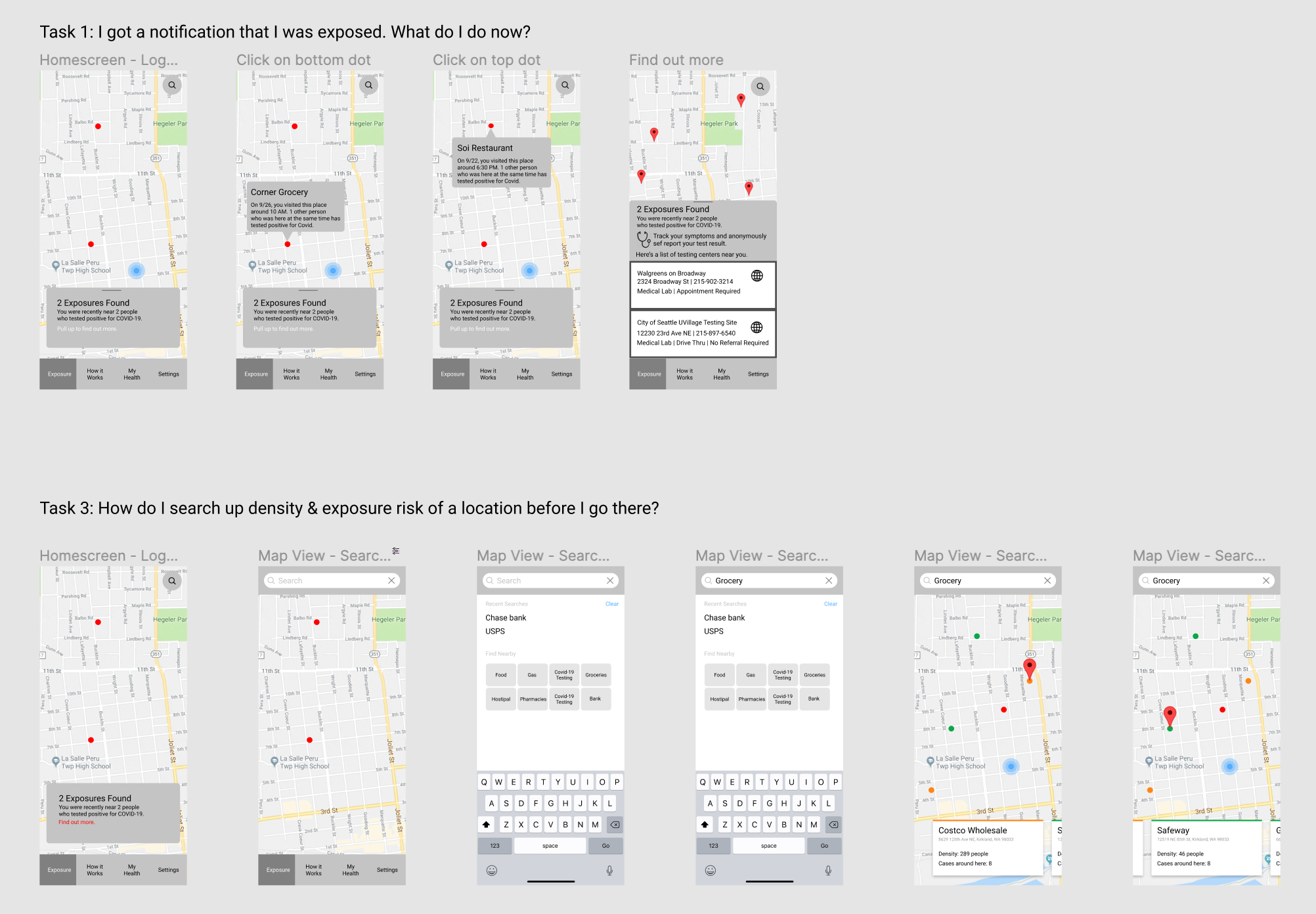
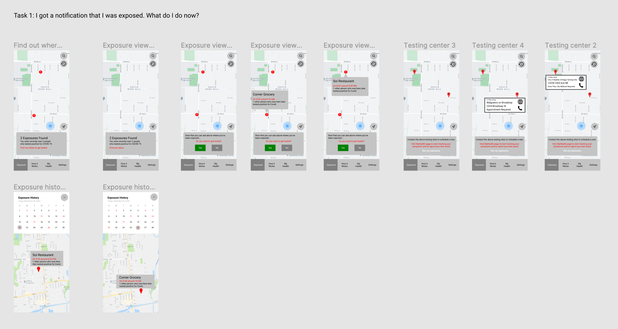
Task 1: Exposures found and notified.
You just got a notification from our app. Looks like the app found 2 exposures for you, can you find out where?
Now that you know where you may have been exposed, do you have recommendations on what to do next in the app? Act on them.
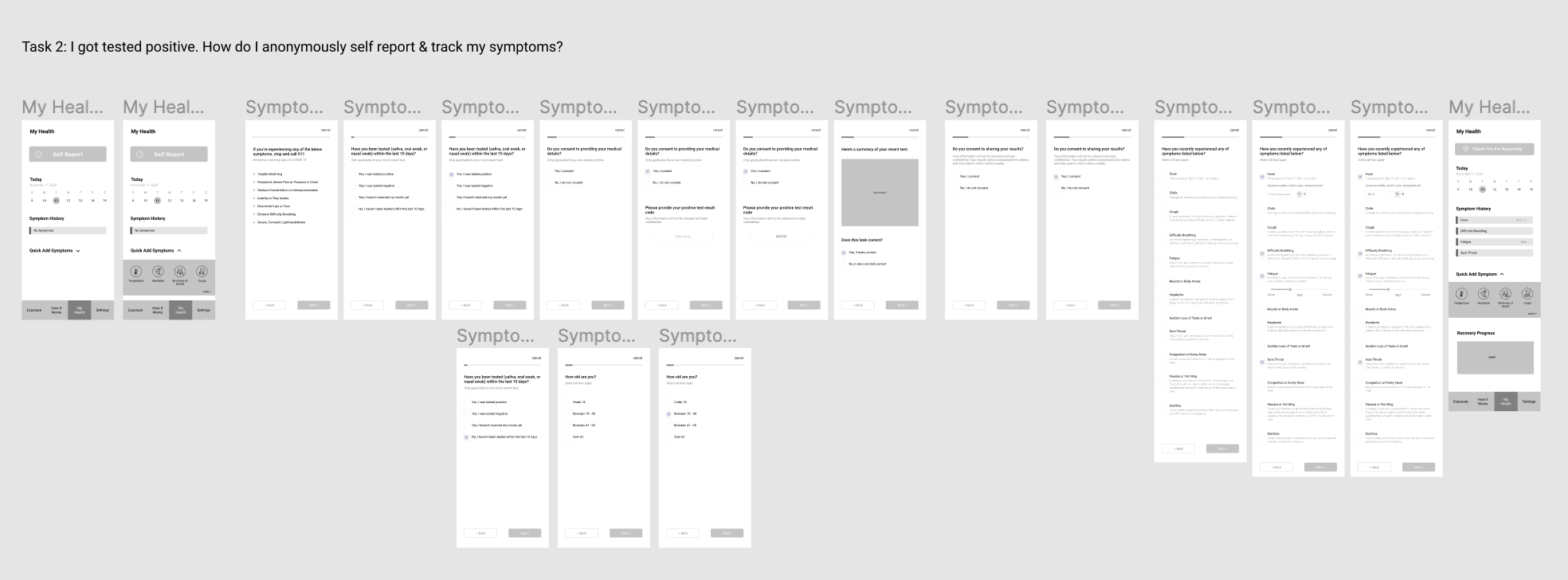
Task 2: Self report.
You just tested positive. Do you know what to do next, based on what the app has told you?
Report your test results.
Track your symptoms.
Task 3: Find our exposure risk before going somewhere.
You want to go to the grocery store. Can you search and find out how risky it would be to go there right now?

One participant doing the in-person moderated usability testing with the think-aloud protocol.
Usability Testing Key Findings
From the feedback we perceived from the participants of usability testing, we identified and synthesized the following key findings:

Changes to Prototype
Based on the key findings from the usability testing sessions, we applied changes to the prototype as the following:

Revised Prototyping
2nd Round of Wireframes


Final Design
Interactive prototype created with Figma:
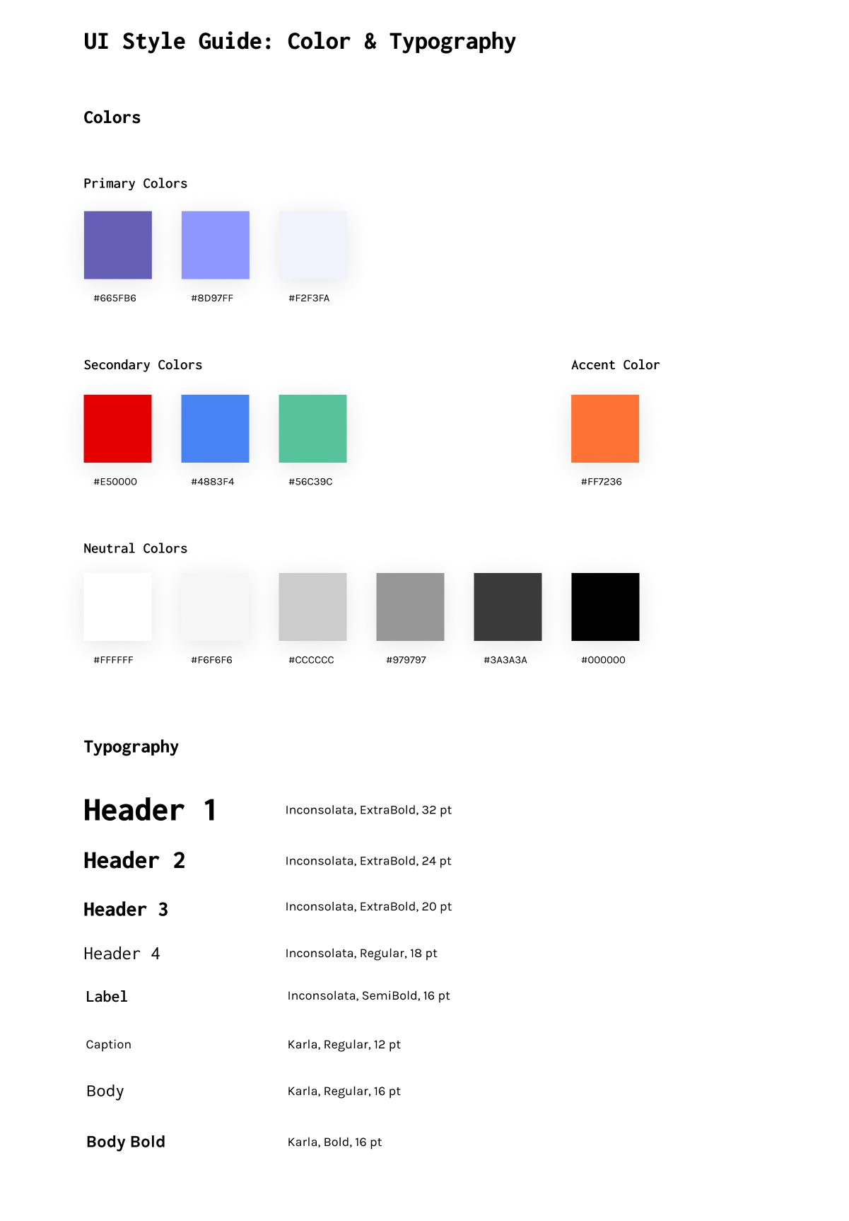
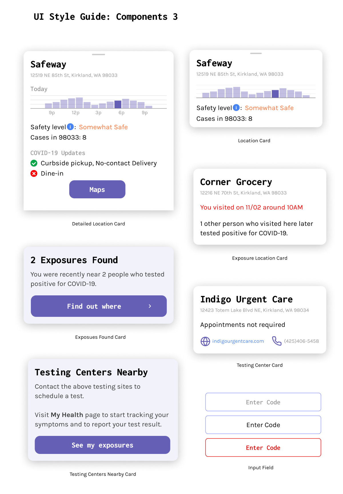
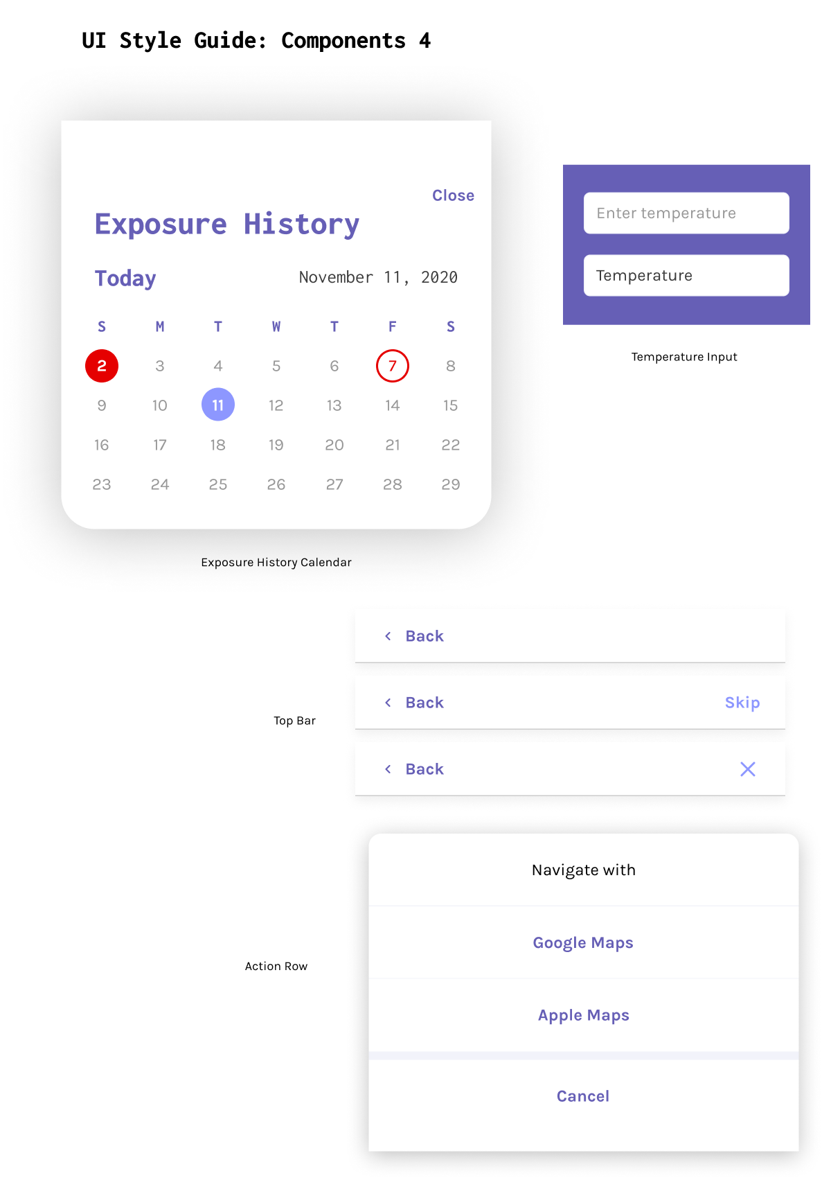
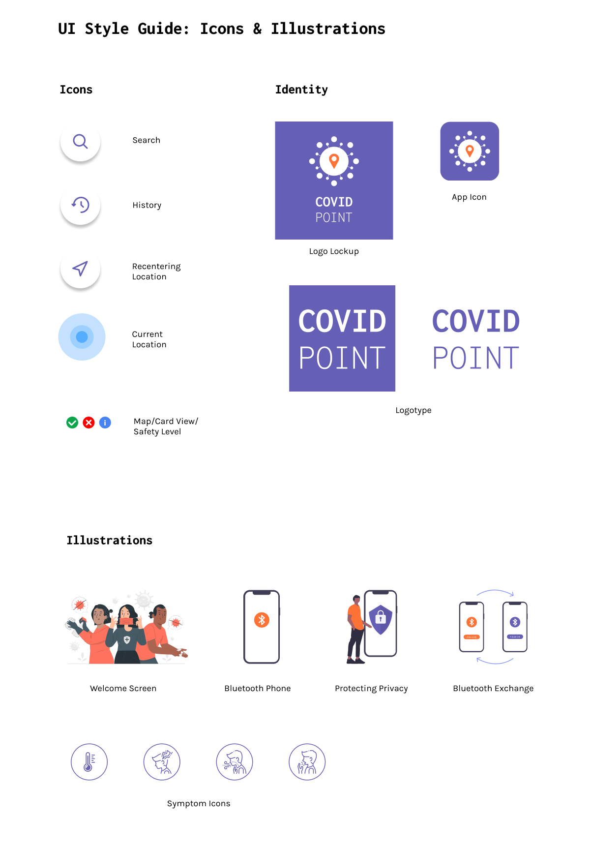
UI Style Guide
After several rounds of explorations, we created a UI style guide that defines colors, typography, brand identity and a collection of reusable components that apply to the high-fidelity prototype. We wanted to instill a sense of well-being, safety and trust into the product.


Future Considerations
Going forward, we aim to further refine and expand COVID Point with a focus on motivating people to use this app and report their test results.
Digital contact tracing has shown to be effective when a significant portion of the population participates. According to Julie Kientz (Chair of HCDE), when it comes to apps like COVID Point and the similar, recently released WANotify, models have shown that with 15% usage, infections can decrease by 11% and deaths by 15%. Though it is important to point out that our app has the advantage of combining data from Bluetooth Exposure Notifications with self-reported and authenticated test results as well as data from WHO, hospitals, and local governments so even as we wait to get up to 15% usage, users will find it helpful.
Friendly reminders to get tested and report their result and notifications to share the app with others can be included to prompt the user to continue using our app. Introducing the app to churches and community centers in rural areas, sharing the app on social media, and creating social campaigns such as the ASL Ice Bucket Challenge can all raise awareness and incentivize users to join. Doing so can foster a sense of community and motivate people to participate in digital contact tracing.
The data presented on the map views can be improved to better represent relevant information. For example, it might be helpful to make the number of cases within a certain zip code more distinctive and show more clearly how the safety level is calculated. We could also generate more fine-grained detail on the micro (e.g., within communities) and the macro level (e.g., across the nation). Additional sources and references can also be included to establish transparency of where we source our data from.
In expanding our app, we might consider implementing new features such as keeping track of vaccinations in the My Health screen and in-app booking for testing locations. All future changes will uphold and maintain values of transparency, protecting the user's privacy, and providing relevant information for users.